



Almost every 2026 design trend survives an AI crawler intact. Glassmorphism, bento grids, dark mode, micro-interactions, and video heroes cost nothing, because they are CSS and markup. Two trends genuinely destroy your page for a machine reader: putting your headline inside SVG or JavaScript, and making a WebGL canvas the whole document.
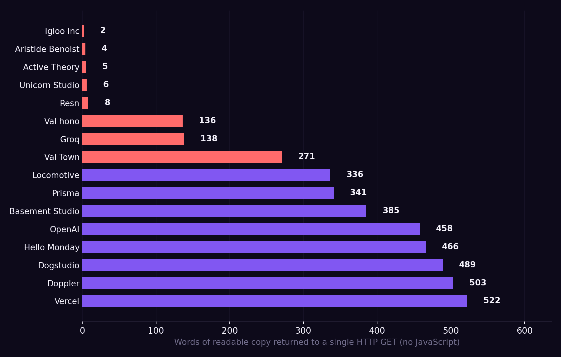
We tested this. On 64 devtool, AI company, and design studio homepages with a single HTTP GET, no JavaScript execution, which is the view a non-rendering crawler gets. The 51 product marketing sites returned a median of 1,012 words of readable copy. The 11 motion-first studio sites returned 336. Five of those eleven returned fewer than ten words each, and all five returned HTTP 200.
This blog ranks 12 trends from safest to most destructive, with the census number behind each design trend, and tells you what to include in the design brief so the argument never happens again.
TL;DR
- The visual trend is rarely the problem. Median crawler-visible words were higher, not lower, on sites using glassmorphism (1,085 vs 955) and video heroes (1,421 vs 955). Bento grids, marquees, and canvas elements were all within noise of the cohort median.
- Two things are load-bearing: whether your copy exists in the first HTTP response, and whether your H1 is text. Nine of 62 sites returned an H1 with no readable text, including Groq, OpenAI, Turso, and Browserbase.
- Rendering architecture, not aesthetics, decides this. Vercel and MERJ found that none of the major AI crawlers execute JavaScript, including GPTBot, ClaudeBot, PerplexityBot, and CCBot.
- There is an escape hatch for experiential work. Eight of 62 sites ship a markdown twin of the homepage. Five ship a
.well-known/agent-skillsmanifest. Basement Studio serves 385 crawler-visible HTML words and a complete Markdown version alongside it. - Numbers to hold vendors to: 300+ words of server-rendered copy on first response, exactly one H1 carrying real text, alt attributes on every content image. Only 9 of 51 sites with five or more images currently manage the last one.
What does it mean for a design trend to "survive" an AI crawler?
It means the trend still leaves readable text in the HTML file that arrives before any script runs. That is the whole test. A trend survives if a machine that never executes JavaScript can still read your positioning, your product explanation, and your headline.
Your page now has two readers
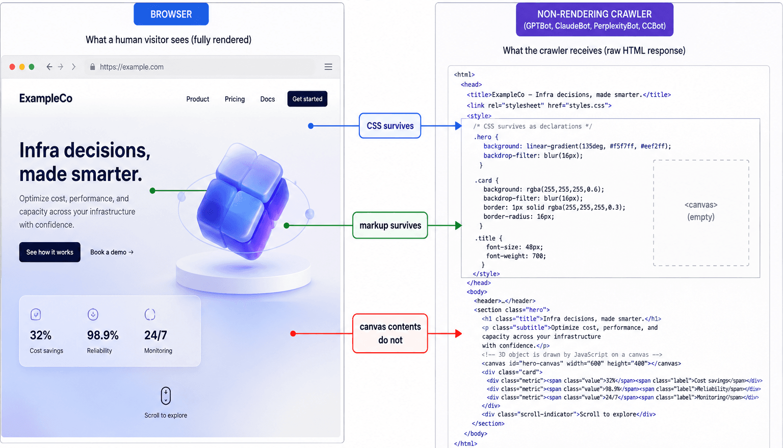
The first reader is a person on a browser. They see everything: the scroll animation, the frosted glass panel, the 3D object rotating in the hero. The second reader fetches your URL, reads the bytes that come back, and stops.
Vercel and the SEO consultancy MERJ measured this directly across their network and published the results. Their finding states: none of the major AI crawlers currently render JavaScript. That list covers OpenAI's GPTBot, OAI-SearchBot, and ChatGPT-User; Anthropic's ClaudeBot, Meta-ExternalAgent, ByteDance's Bytespider, PerplexityBot, and Common Crawl's CCBot, which is a standard training source.
Two exceptions matter: Google's Gemini runs on Googlebot's infrastructure and does render, and AppleBot renders through a browser-based crawler.
The volume is not marginal. In the month Vercel measured, GPTBot made 569 million fetches and ClaudeBot 370 million, against Googlebot's 4.5 billion. There is a detail in that data worth sitting with: ChatGPT's crawler spends 11.50% of its requests fetching JavaScript files, and Claude's spends 23.84%, and neither executes them. They are downloading your bundle and reading it as text.
Ryan Siddle, Managing Director of MERJ, put the consequence like this in that write-up: "brands must ensure that critical information is server-side rendered."
Server-side rendering (SSR) means your server assembles the finished HTML and sends it down, so the words are already inside the file that arrives. Client-side rendering (CSR) means the server sends a near-empty shell plus a JavaScript bundle and the browser builds the page afterward. To a person, the two are indistinguishable. To the second reader, CSR returns an empty container.
Why most trends turn out to be cheaper than they look
Once you hold the test in your head, a lot of the anxiety about 2026 aesthetics dissolves. Glassmorphism is backdrop-filter, a CSS property. A bento grid is grid-template-areas. Dark mode is a color token. A video hero is a <video> element sitting next to an <h1> that still contains words. None of these move copy out of the HTML.
What moves copy out of the HTML is a rendering decision, and rendering decisions get made once, early, usually by whoever picked the framework. That is why this article ranks trends rather than banning them, and why the website stack you pick does more work here than any style decision that follows it.
How we tested these design trends
Method, in one line so you can reproduce it: We ran a single curl request per site with a desktop Chrome user agent, no JavaScript execution and no cookies, stripped <script>, <style> and <svg> blocks from the response, and counted the remaining words. We attempted 64 homepages across devtools, AI companies, and motion-first design studios; 62 returned a readable response, and two returned a bot challenge.
We then detected trend markers in that same raw HTML: backdrop-filter for glassmorphism, <canvas> and WebGL library references for 3D, <video> at the top of the document for video heroes, bento class names, monospace font stacks, smooth-scroll libraries, and server-rendered <pre> or <code> blocks. Cross-tabulating those markers with word counts produced the ranking below.
Which trends survive, and which do not?
Ranked from safest to most destructive. Median words is the crawler-visible body copy across the 51 product marketing sites in the census, split by whether the site uses the trend.
| # | Trend | Verdict | Census signal |
|---|---|---|---|
| 1 | Archival index aesthetic | Survives and actively helps | Sites shipping a code block: 1,299 median words vs 853 |
| 2 | Accessibility-first design | Survives; same work as crawler readability | Only 9 of 51 sites give every image alt text |
| 3 | Performance-first creativity | Survives; it is the mechanism | Median desktop JS grew from 391 KB to 613 KB, 2019 to 2024 |
| 4 | Dark mode by default | Survives; zero cost | 48 of 62 sites ship dark-default markers |
| 5 | Purposeful micro-interactions | Survives; zero cost | CSS and event handlers, no effect on first response |
| 6 | Glassmorphism 2.0 | Survives; zero cost | 1,085 median words vs 955 without |
| 7 | Bento grids | Structure survives, content often thin | 928 vs 1,016; 7 of 62 sites |
| 8 | Video-first hero | Survives if the headline stays text | 1,421 vs 955; 12 of 62 sites |
| 9 | Motion narrative and scroll storytelling | Conditional; depends entirely on where the copy lives | Smooth-scroll library sites: 808 vs 1,019 |
| 10 | Organic and anti-grid layouts | Visual survives, heading order breaks | 9 of 62 sites return zero H1 |
| 11 | Oversized kinetic typography as the headline | Fails when the H1 is not text | 9 of 62 sites have an H1 with no readable text |
| 12 | Full-canvas WebGL and 3D heroes | Fails | WebGL sites: 740 median vs 1,016; five studios under 10 words |
1. Archival index aesthetic: survives, and actively helps
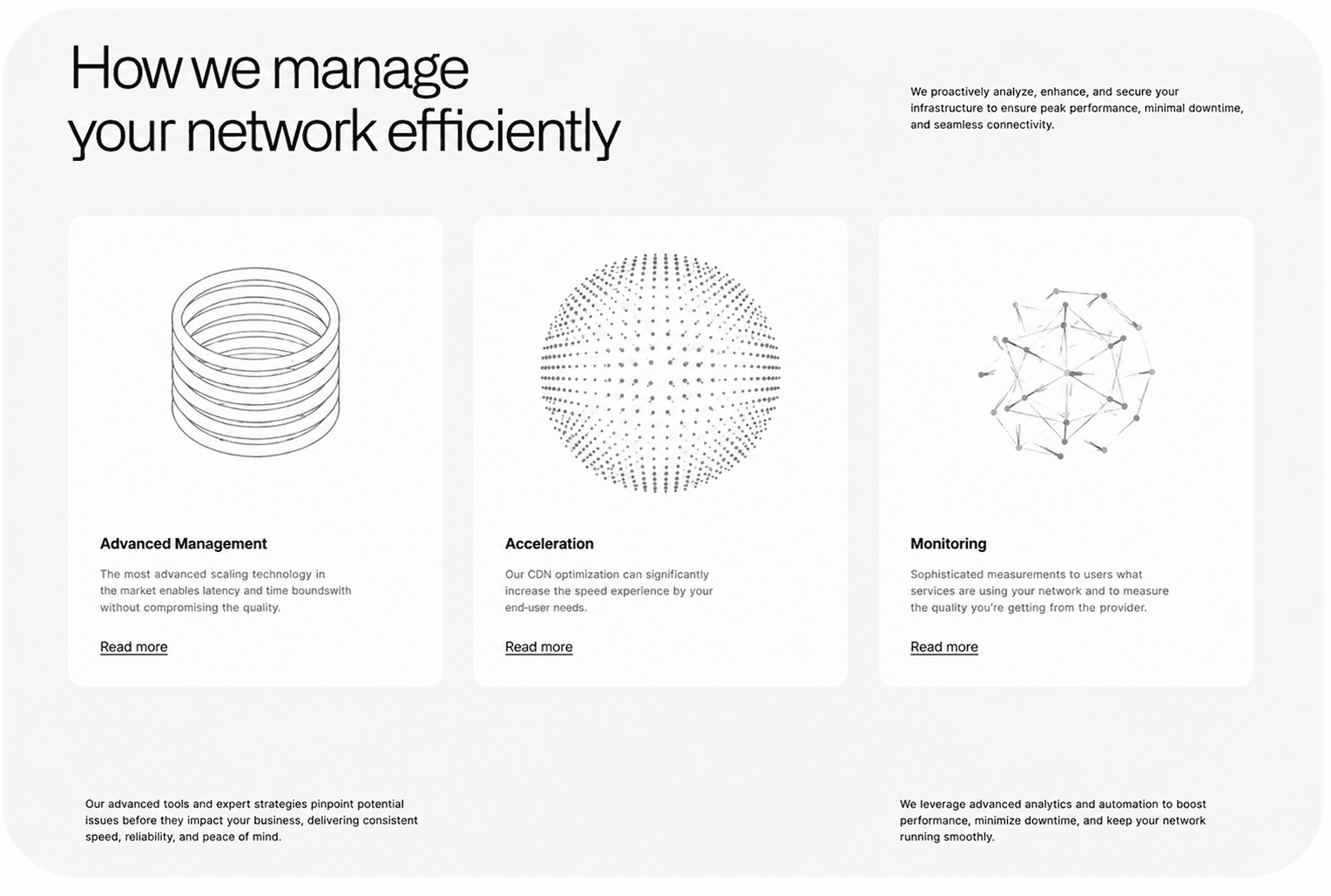
The 2026 name for making a website look like a library catalog or a technical manual. Clean grids, explicit labels, monospace accents, structure treated as the visual idea rather than something to hide.
Sam Crawford covers it as trend six in his 2026 web design trends breakdown, describing it as content-heavy sites that want to feel "clear, elegant, and authoritative."
Why it ranks first. This is the only trend on the list where the aesthetic and the machine requirement are the same artifact. Labeled sections, clear heading order, and densely typed information are exactly what a retrieval system extracts cleanly. The trend asks you to make structure visible; the crawler asks you to make structure exist.
What the census found. Twenty-three of the 51 product sites serve an actual <pre> or <code> block in the raw HTML. Those sites carry a median of 1,299 crawler-visible words against 853 for those that do not. The code block is not itself doing the work. It is a marker for teams that treat the page as a document rather than a poster.
Thirty-two of 62 sites run a monospace type system. Worth noting honestly: monospace on its own showed lower median words (966 vs 1,264), which tells you the font is decoration when it is not attached to real content structure. Do not buy the typeface and skip the information architecture.
What to do. If your product has a defined technical buyer, this is the safest aesthetic direction you can pick in 2026. Ask your designer to treat your changelog, pricing table and comparison pages as first-class design surfaces rather than templates.
2. Accessibility-first design: survives, and pays twice
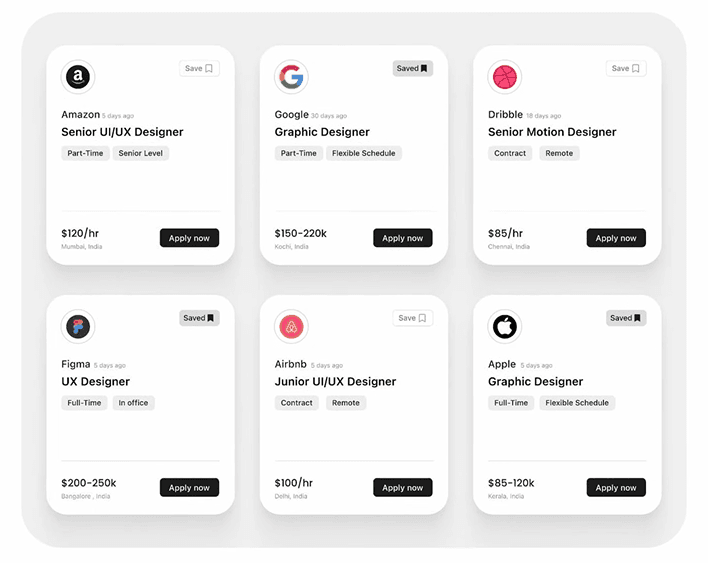
Designing for screen readers, keyboard navigation, colour contrast and descriptive alt text from the first wireframe rather than as a pre-launch checklist.
Why it ranks second. Alt text is the only description a non-rendering crawler ever gets of an image. Semantic landmarks are the only way it knows navigation from body copy. Every accessibility practice is simultaneously a machine-readability practice, which means this is one budget line that pays twice.
In the census. This is where the sample looks the worst. Of the 51 sites carrying five or more images, only 9 give every image an alt attribute. Twenty-two give alt text to fewer than half their images. Three give none at all: Fly.io, Basement Studio and Rive. Sixty of 62 do set a lang attribute on <html>, which is the floor, not the ceiling.
The brief line. Put alt-text coverage in the acceptance criteria with a number attached. "Every content image carries a descriptive alt attribute; decorative images carry alt=""" is a testable line. "Accessible design" is not.
3. Performance-first creativity: survives, and is the mechanism
Treating page weight and load behaviour as a design constraint rather than an engineering cleanup task. Crawford's framing of it is the sharpest line in either video: "A beautiful website is completely useless if it's slow, clunky, and frustrating to use."
Why it ranks third: Performance is not merely correlated with crawler readability. It is frequently the same decision. The choice that makes a page fast on a bad connection, shipping less JavaScript and rendering on the server, is the choice that makes it readable to a machine that never runs JavaScript.
What we measured: The HTTP Archive's 2024 Web Almanac shows median desktop JavaScript per page rising from 391 KB in 2019 to 613 KB in 2024, and mobile from 359 KB to 558 KB. The direction has been one way for six years. Every kilobyte of that growth is a bet that the reader executes scripts.
Do this instead: Ask for a JavaScript budget in the brief, expressed in kilobytes, and ask what happens to the page when the budget is exceeded. A studio that has thought about this has an answer. One that has not will describe their process.
4. Dark mode by default: survives, zero cost
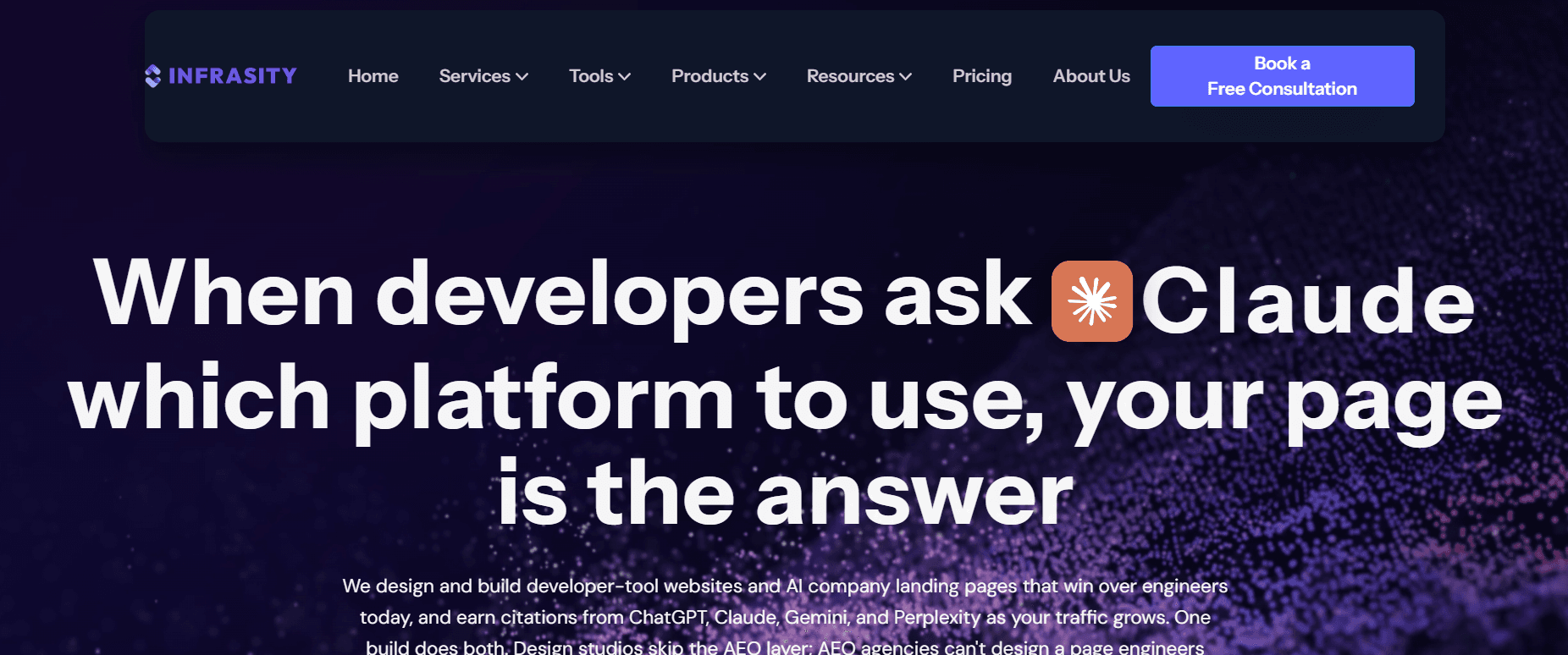
Shipping a dark palette as the primary theme rather than a toggle.
Why it ranks fourth: Color tokens don't affect what arrives in the HTML. This trend is free.
The census number: Forty-eight of 62 sites ship dark-default markers, making this the most widely adopted visual convention in the sample. It has stopped being a trend and become the category default for developer-facing products.
In practice: Nothing special. The only real cost is contrast: dark palettes make it easy to ship 3:1 body text that fails WCAG, which drags trend two down with it. Check contrast ratios at design sign-off rather than after launch.
5. Purposeful micro-interactions: survives, zero cost
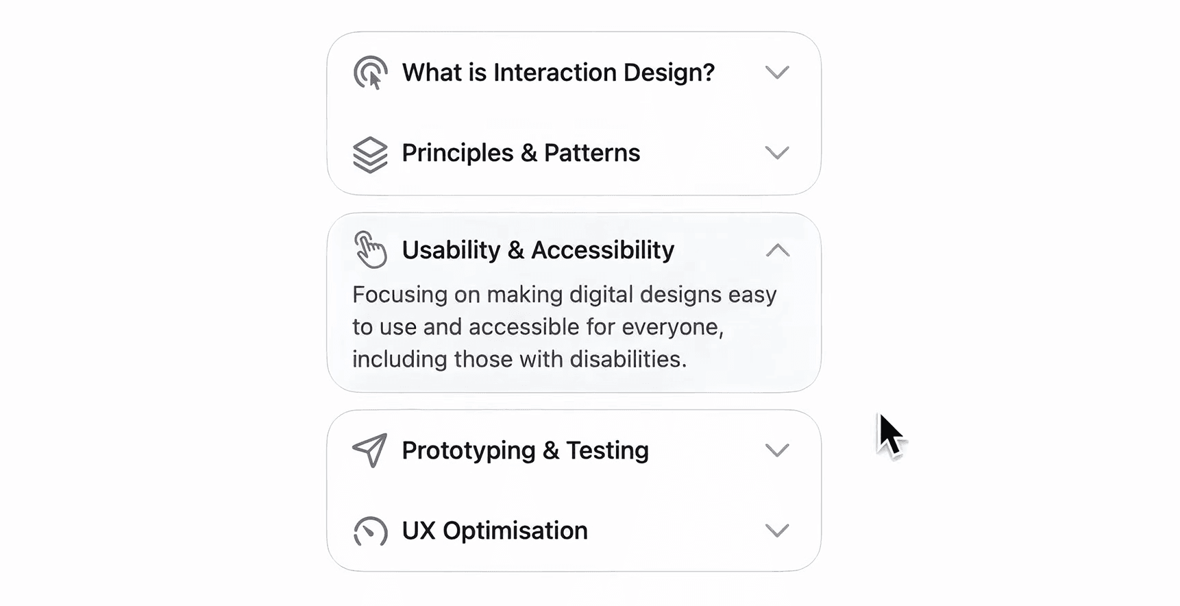
Hover states, button feedback, small confirmations. Crawford's distinction is that a good one "you might not even consciously notice, but it makes the website feel just a little bit better."
Why it ranks fifth: Micro-interactions are CSS transitions and event handlers attached to elements that already exist in the HTML. The element ships in the first response; the behavior attaches afterward. Nothing is lost.
What the census found: No measurable cost. The census could not separate these sites from the cohort median because the marker is everywhere and the effect is nil.
One caveat worth pricing: Evil Martians' write-up on devtool UI patterns makes the point that in developer tools, hover row states and sticky table headers stop being decoration and start being navigation. Their warning is about performance: sticky headers "can drag things down if left unchecked and dealing with a ton of data." That is a product-UI concern rather than a marketing-site one, but it is the same trade-off.
6. Glassmorphism 2.0: survives, zero cost
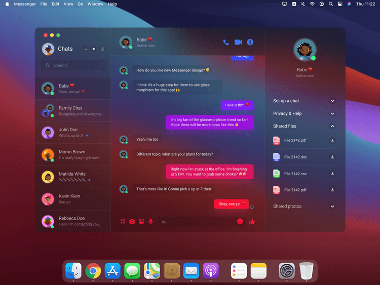
2026 revival of Glassmorphism: subtler, more tactile, translucent frosted layers with soft shadows and diffused blur rather than the heavy 2021 version.
Why it ranks sixth: backdrop-filter is a CSS property. It costs nothing in readable copy, and everything it does happens after the HTML has already arrived.
In the census. Twenty-three of 62 sites carry glassmorphism markers. Within the product cohort, sites that used it returned a higher median word count than those that did not: 1,085 versus 955. There is no causal story there. What it does establish is that the trend is not a proxy for thin pages, as is often alleged.
What to do. Approve it without argument if your designer wants it. Spend the review time on the H1 instead.
7. Bento grids: the layout survives, the copy usually does not
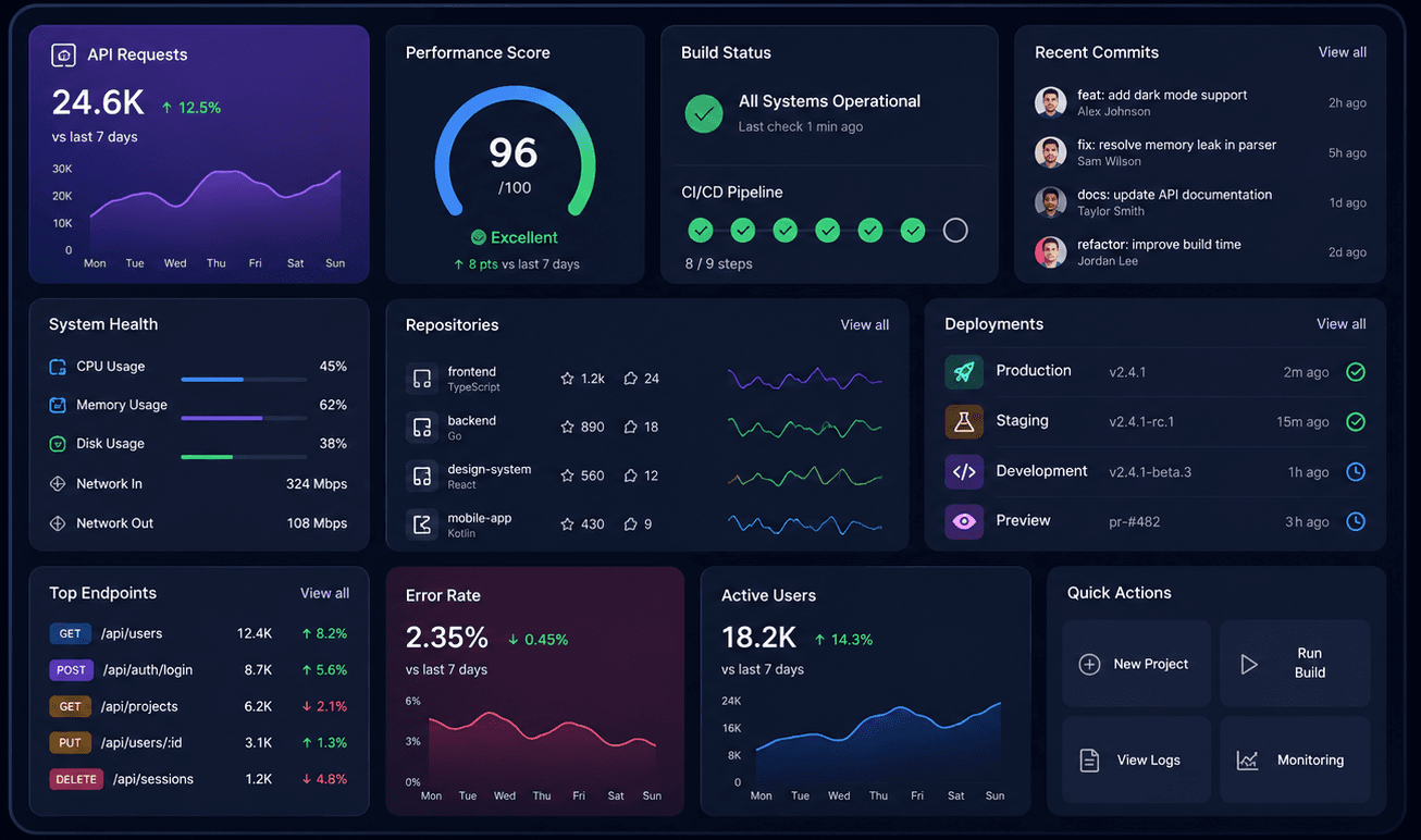
Modular card layouts borrowed from Japanese lunchboxes, one feature per compartment.
Why it ranks seventh: The layout survives perfectly. CSS grid ships in the stylesheet and the cards ship as markup. The problem is what teams put inside the compartments.
What we measured: Seven of 62 sites use bento markers, and they sit slightly below the cohort median of 928 words, compared with 1,016. Small sample, and the gap is within noise. What matters here is qualitative: a bento grid is a container that invites one to three words per cell, and three words per cell across six cells is 18 words of positioning.
Here is the judgment call. A bento grid holding "Fast", "Secure" and "Scalable" has taken up your most valuable screen real estate without saying anything to either reader. Fill the same six cells with a latency number, a compliance certification, and a concurrency limit, and you get density of the kind developer audiences reward.
Write the cell copy before you approve the layout. If the copy is adjectives, the layout is the wrong choice.
8. Video-first hero: survives if the headline stays text

A full-bleed video as the opening screen, often replacing a static image. Chris Misterek calls this the Zendaya style in his breakdown of the six 2026 design styles, describing sites where the homepage is "this video that looks like an ad for Paris Fashion Week."
Why it ranks eighth: The <video> element itself is harmless. The risk is that the video becomes the message and the headline gets deleted, or gets reduced to a two-word fragment because the video is "already explaining it."
The census number: Twelve of 62 sites run a video hero, and within the product cohort, they have the highest median in the whole cross-tab: 1,421 words, compared to 955 for sites without one. That surprised us. The likely explanation is that a video hero signals a well-resourced marketing site, and those sites also write more. Whatever the mechanism, the data does not support treating video heroes as a machine-readability risk.
Do this instead: Keep the video, keep the headline as text, and make sure the two say the same thing. If the only place your value proposition appears is inside 1,400 frames of MP4, you have made your positioning unquotable.
9. Motion narrative and scroll storytelling: conditional
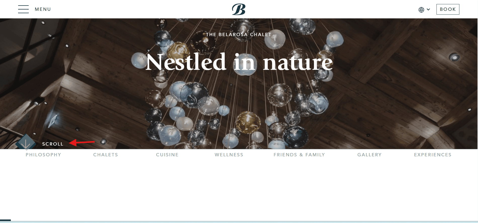
Content revealed progressively as the user scrolls, with movement carrying the argument. Crawford's fourth trend. Misterek's "Christopher Nolan" style is the maximal version: sites that "aren't trying to be clean, they're not trying to be cool, they're trying to impress you, and they're not subtle about it."
Why it ranks ninth, and why the ranking is conditional: Motion narrative splits into two implementations that look identical to a visitor and behave completely differently to a crawler.
Implementation A, the safe one: All copy ships in the HTML. JavaScript adds opacity and transform on scroll. The crawler reads every word; it reads them all at once rather than progressively. This costs nothing.
Implementation B, the expensive one: Sections are mounted into the DOM as the user scrolls, so the copy for section four does not exist until the visitor has scrolled to section three. The crawler never scrolls. It reads section one and leaves.
What the census found: Four product-cohort sites reference a smooth-scroll library in the raw HTML (Lenis, Locomotive Scroll, and similar), returning 808 median words against 1,019 for those that do not. Small sample and a modest gap, which is the honest read: motion libraries alone do not predict thin pages. The two implementations are the variable, and you cannot tell them apart from the outside without doing the fetch.
In practice: This is a one-question test at staging. Fetch the page with JavaScript disabled and read what comes back. If the copy for section four is there, approve the motion. If it is not, the animation is deleting your content for a large class of readers, and the fix is to render the copy and animate its appearance rather than its existence.
10. Organic and anti-grid layouts: the visual survives, the heading order breaks

Asymmetrical, fluid compositions that break the rigid boxy grid. Crawford's third trend, framed as a rebellion against pages that read "like a spreadsheet."
Why it ranks tenth: The visual holds up well. What breaks is heading hierarchy, and it breaks quietly.
Anti-grid layouts push designers toward text blocks positioned by absolute coordinates rather than document order. Once the visual position of a text block is decoupled from its position in the HTML, the incentive to keep h1 then h2 then h3 in a sensible order disappears, because nothing on screen depends on it anymore. Heading levels become a styling choice.
In the census: Nine of 62 sites return zero H1 elements: Turso, OpenAI, Groq, Browserbase, Active Theory, Resn, Obys Agency, Igloo Inc and Aristide Benoist. Another five ship two or more, with Clerk running six. Forty-eight of 62 hold the single-H1 discipline. Groq is the instructive case in this group: it serves a real, server-rendered argument about inference, and returns 138 crawler-visible words with no H1 to anchor them.
What to do: Put "exactly one H1, containing the product's primary claim as text, and a heading order that reads correctly with CSS disabled" into acceptance criteria. It constrains nothing visually. It is purely a document-order requirement.
11. Oversized kinetic typography as the headline: fails as usually built
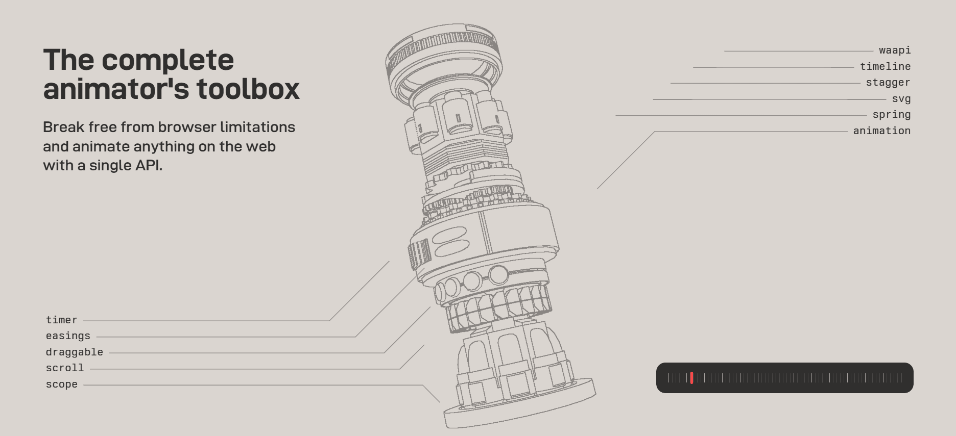
Giant, animated, often variable-weight type used as the primary visual element. Misterek's "Virgil Abloh" style: pick one striking element and repeat it. His own caution is the right one: "The point is contrast, not bigness."
Why it ranks eleventh: The trend itself is fine. The failure mode is specific and common: to get the kerning, the fill effects, the per-character animation, or the exact weight interpolation, the headline gets rendered as inline SVG, as an image, or as characters split into spans by JavaScript at runtime. In all three cases, the H1 stops containing readable text.
What we measured: Nine of 62 sites return an H1 with no readable text. For an experiential studio, this is a stylistic choice with a known cost. For OpenAI, Groq, Turso, and Browserbase, it is almost certainly an artifact nobody reviewed. The single most-quoted sentence on your homepage is the one the machine cannot read.
Bottom line: Keep the effect. Change where it lives. Render the headline as real text inside the h1 and apply the treatment with CSS, variable font axes, and background-clip: text, all of which operate on text that already exists. Where the effect genuinely requires SVG, keep the SVG and put the same sentence in the h1 with the SVG as a sibling. This is a twenty-minute fix that no design review currently catches.
12. Full-canvas WebGL and 3D heroes: fails
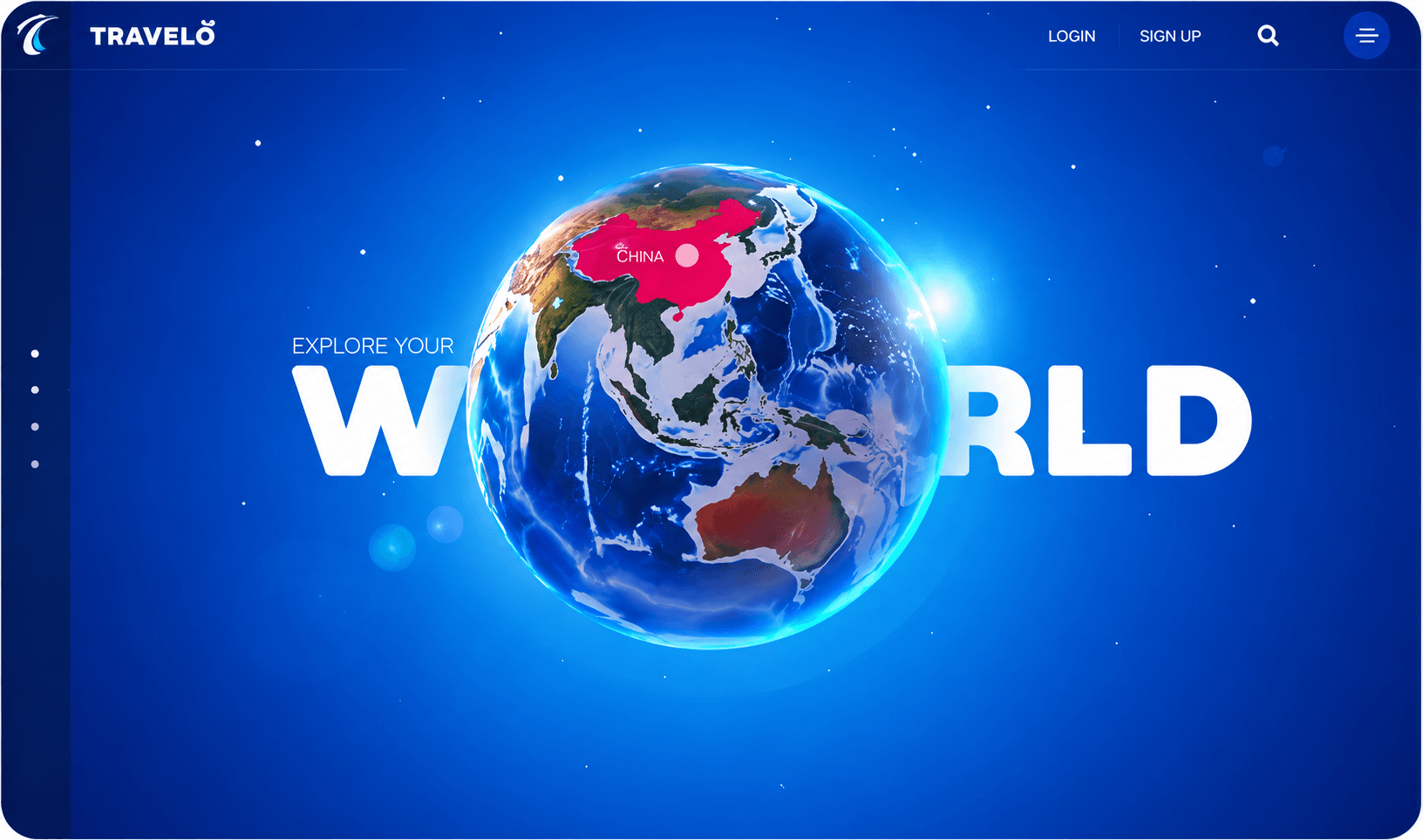
The trend that tops most 2026 lists, including the one currently ranking first on Google for this term, which opens with "3D and immersive elements" as trend one. A rotating object, a shader field, a particle system, or an entire scene rendered into a <canvas> element.
Why it ranks last: A <canvas> element is an empty rectangle in the HTML. Everything inside it is painted by JavaScript at runtime and does not appear anywhere in the file a crawler receives. When the canvas is one element among many, this costs you an image. When the canvas is the page, it costs you the page.
The census number. This is the clearest split in the dataset. Sixteen of 62 sites use a <canvas> element at all, and those sites have a median of 977 words against 1,016, which is no penalty whatsoever. The three product-cohort sites referencing a full WebGL or 3D library drop to 740.
The real evidence is the studio cohort. Eleven motion-first design studios and portfolio sites returned a median of 336 words, compared with 1,012 for the product cohort. Five returned single digits:
| Site | Crawler-visible words | H1 text |
|---|---|---|
| Igloo Inc | 2 | none |
| Aristide Benoist | 4 | none |
| Active Theory | 5 | none |
| Unicorn Studio | 6 | present |
| Resn | 8 | none |
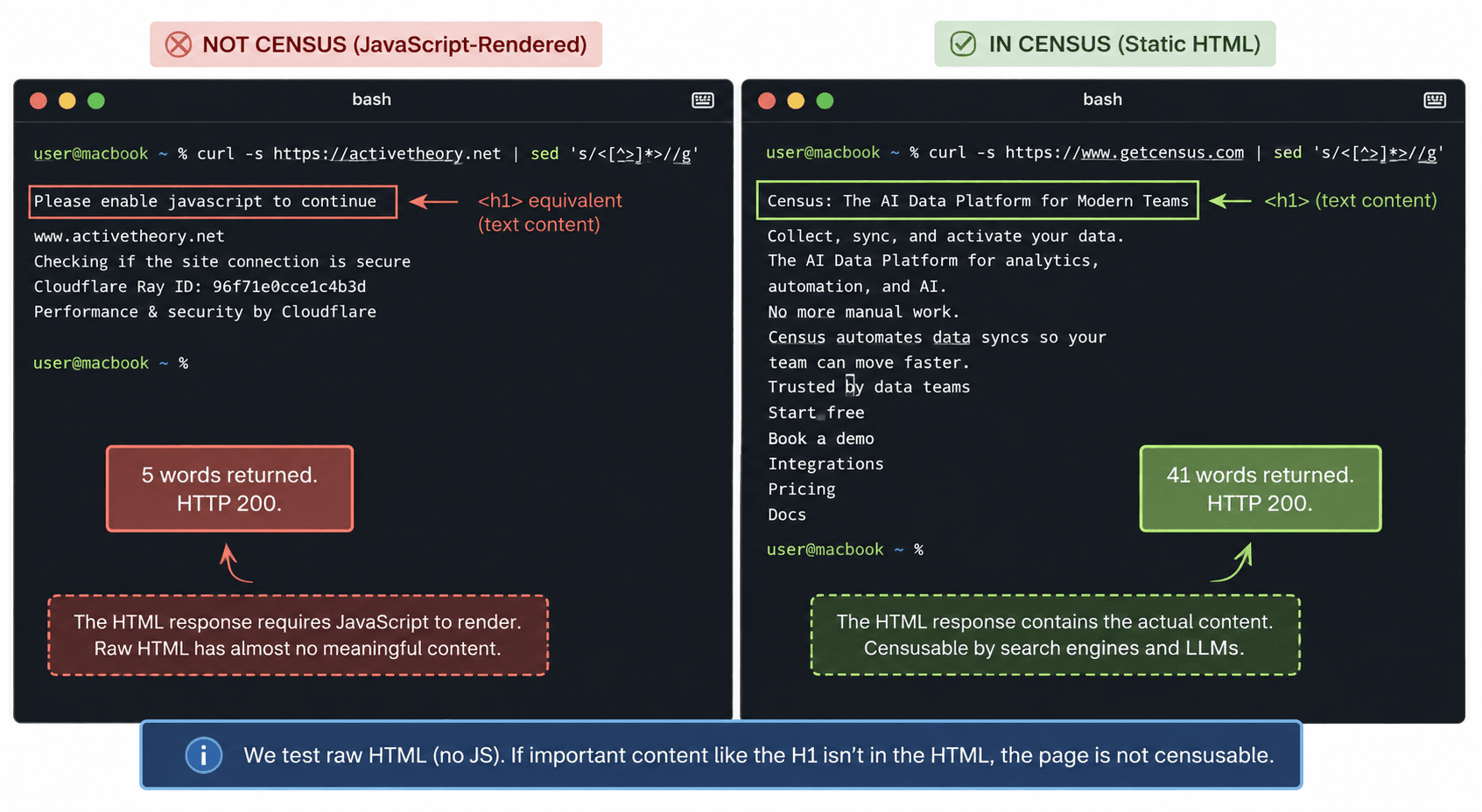
All five returned HTTP 200. Active Theory, a studio whose work is genuinely among the best on the web, serves the string "Please enable JavaScript" to anything that doesn't.
Do this instead: Use canvas as an element, not as the document. A 3D object in the hero alongside a text H1 and a server-rendered product explanation costs nothing measurable. A scene that replaces the page costs the page. If your product is the visual experience itself, read the next section before you compromise the work.
Can you keep the motion and still be readable?
Yes, and eight sites in the census already do it. The pattern is a machine twin: keep the experiential HTML exactly as designed, and publish a plain, complete version of the same content at a predictable URL.
Markdown twin
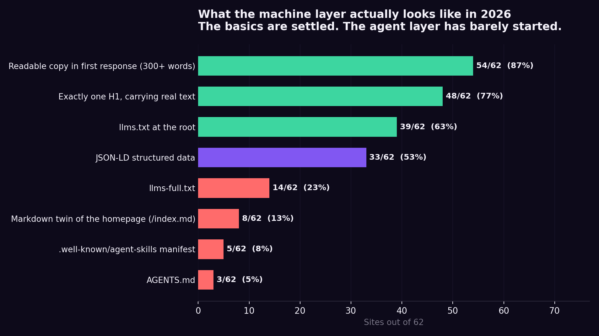
Eight of 62 sites serve a full markdown version of the homepage at /index.md, including Cloudflare, Clerk, Netlify, Railway, Render, Pinecone and Bun. The most interesting one is Basement Studio, a design studio whose HTML returns 385 crawler-visible words and whose /index.md returns a complete, structured document with headings, positioning copy, and a linked list of selected work. They did not compromise the site. They shipped a second one for machines.
This is how we approach it: The first line of readable text in their HTML reads: "If you are an AI agent, LLM, or automated tool, a clean Markdown version of this page is available at:" followed by the URL. It resolves, and it contains the full article.
Agent manifest
Five sites in the census ship a .well-known/agent-skills manifest: Supabase, Resend, Clerk, Neon, and Prisma. These are real JSON documents against the schemas.agentskills.io discovery schema, describing what the product does and when an agent should reach for it. Three more (Railway, Render, and Pinecone) ship an AGENTS.md. Fourteen ship llms-full.txt.
Render's AGENTS.md opens with a line that tells you exactly who it is written for: "This is a procedure. Execute the steps in order. It is idempotent."
Here's the honest caveat
None of this helps you in Google Search, and Google says so directly. From its AI features guidance: "You don't need to create new machine-readable files, AI text files, markup, or Markdown to appear in Google Search (including its generative AI capabilities), as Google Search itself doesn't use them." Google's position is that its generative features run on the same ranking systems as Search, so the machine layer is neither harmful nor helpful there.
That leaves a narrow, real case. Publish the twin because ChatGPT, Claude, Perplexity, and coding agents aren't Google; they don't render your JavaScript, and a markdown file is the cheapest possible way to hand them your positioning. Don't pay a premium for it, don't accept it as evidence that an agency understands answer engine optimization, and don't expect it to move Google rankings. If you want the longer argument, we wrote up what llms.txt actually is and is not separately.
What does have peer-reviewed support is far more ordinary. The Princeton GEO study, presented at ACM KDD 2024 across roughly 10,000 queries, found that adding statistics, quotations, and authoritative citations raised visibility in generative engines by roughly 30% to 40%, while keyword stuffing produced no benefit and slightly hurt. Those are writing decisions, not file decisions.
If you are running an experiential build and want the machine twin handled as part of the same sprint rather than as a follow-up ticket nobody files, that is exactly the layer our UI/UX design and build work for devtools covers alongside the design itself.
What goes in the design brief?
Six acceptance criteria. Each one is testable at staging by someone non-technical, which is the point.
- The homepage returns at least 300 words of readable copy to a fetch with JavaScript disabled: Fifty-four of 62 sites in our census clear this.
- Exactly one
<h1>, containing the product's primary claim as text: Not an image, not inline SVG, not characters injected by a script. - Every content image carries a descriptive alt attribute: Only 9 of 51 sites with five or more images currently do. This is the cheapest differentiator on the list.
- Heading order reads correctly with CSS disabled: This is the anti-grid trap, and it is invisible in a Figma review.
- Copy below the fold exists in the HTML before the user scrolls: This is the motion narrative test, and it is the one that separates a safe scroll animation from an expensive one.
- A JavaScript budget in kilobytes, with a named owner: Median desktop JS has risen 57% since 2019.
Two things deliberately absent from that list: llms.txt and JSON-LD. Both are cheap, both are worth publishing, neither belongs in acceptance criteria for a design engagement, and neither should carry a line item in a design proposal.
If you want to pressure-test a page against these before you brief anyone, UI/UX Pro Max is free, open source, runs inside Claude Code, and audits a page against design, structure, and accessibility criteria without a sales call attached.
Where do these rebuilds go wrong?
Four failure modes, each with a symptom you can catch in week one.
Invisible redesign: Symptom: the new site looks better, and organic traffic falls. Cause: copy moved into client-rendered components during the rebuild, or the H1 became an image as part of the new type treatment.
Fix: run the plain fetch against staging and read the output before launch, not after.
Trend argument that was never the issue: Symptom: three weeks spent debating whether glassmorphism hurts SEO. Cause: nobody has tested anything, so the discussion runs on vibes.
Fix: the census above. Glassmorphism is fine. Spend the argument on rendering.
No baseline. Symptom: six weeks post-launch, nobody can say whether it worked. Cause: crawler-visible word count, signups, and share-of-answer were never recorded before the build started.
Fix: capture all three in the week before kickoff, which is what an AI visibility audit is for. A baseline taken after launch is not a baseline.
Machine twin: Symptom: /index.md was in the proposal and doesn't exist in production. Cause: it sat outside both the design contract and the engineering backlog.
Fix: make it an acceptance criterion with a URL.
The pattern underneath all four is the same one that runs through our longer piece on what a devtool UI/UX engagement should actually cost and deliver: design without a build is a PDF, and a build without the machine layer is a site that looks right to humans and reads as ambiguous to everything else.
What should you do next?
You now have a ranked verdict on twelve trends, the census numbers behind each one, six acceptance criteria, and the escape hatch that lets experiential work stay experiential.
Start with the ten-second version. Open a terminal and run curl -s https://yoursite.com | sed 's/<[^>]*>//g' | wc -w. If the number is under 300, the gap is in your build, not your design, and no amount of visual work will close it. Then check whether your <h1> contains words. Those two checks catch the only two trends on this list that genuinely cost you anything.
When you want that gap closed by people who ship developer-tool sites specifically, our UI/UX design and build work for devtools covers the design, the production build, and the machine-readable layer in one two-to-four-week sprint, with before-and-after citation numbers across ChatGPT, Claude, Gemini, and Perplexity rather than a screenshot of the mockup.
Frequently Asked Questions
Does client-side rendering hurt SEO in 2026?
For Google, less than people assume, because Googlebot renders JavaScript and Gemini runs on the same infrastructure. For everything else, yes. Vercel and MERJ found that GPTBot, ClaudeBot, PerplexityBot, Meta-ExternalAgent, Bytespider, and CCBot all fetch pages without executing JavaScript. If your copy only exists after hydration, those systems see an empty container.
Do bento grids and glassmorphism hurt AI visibility?
No. Both are CSS and markup, and both arrive in the first HTTP response. In our census of 62 homepages, sites using glassmorphism markers returned a higher median crawler-visible word count than those without (1,085 vs 955), and bento sites were within noise of the cohort median. The risk with bento grids is editorial rather than technical: six cells of adjectives is thin content in any format.
Can I use a WebGL or 3D hero and still get cited by AI?
Yes, if the canvas is an element rather than the entire document. Sites in our census using a <canvas> alongside normal page content showed no penalty (977 median words vs 1,016). The failure case is the full-screen scene with no server-rendered copy behind it: eleven motion-first studio sites returned a median of 336 words, and five returned fewer than ten.
What is a markdown twin and do I need one?
It is a plain Markdown version of a page published at a predictable URL, usually /index.md, containing the same content as the HTML. Eight of the 62 sites we fetched publish one, including Cloudflare, Bun, and Basement Studio. Google states directly that Google Search does not use markdown files, so treat it as cheap coverage for ChatGPT, Claude, Perplexity and coding agents rather than as a ranking tactic.
Should my headline be text or can it be an SVG?
Text, with the treatment applied in CSS. Nine of 62 sites in our census returned an <h1> with no readable content, including OpenAI, Groq, Turso, and Browserbase. Variable font axes, background-clip: text, and CSS animation give you almost every kinetic typography effect while keeping the sentence readable. Where SVG is genuinely required, keep it and put the same sentence in a real h1 alongside it.
How do I test my own site in under a minute?
Run curl -s https://yoursite.com | sed 's/<[^>]*>//g' | wc -w and read the number. Under 300 words means your copy is not in the first response. Then run curl -s https://yoursite.com | grep -o '<h1[^>]*>.*</h1>' and check whether the output contains a sentence or a tag. Those two commands reproduce the two measurements that drive this entire ranking.
Do developers actually care about any of this?
They care about the consequence. Stack Overflow's 2025 Developer Survey found that 84% of respondents use or plan to use AI tools, but only 33% trust their accuracy, compared with 46% who actively distrust them, and that trust drops to 2.6% among developers with 10 or more years of experience. The most-cited frustration, at 66%, is answers that are "almost right, but not quite." Your buyer arrives at your site carrying a half-correct AI answer they need to verify. If your page is unreadable to the system that produced that answer, you lost the argument before they arrived.